
Exploring data in jupyter
Given that we arrived with the elves in jupyter only yesterday and that we have come so far from home it is worth having a nose around. Today we introduce the basics of dataset exploration. This we can do very well in our new jupyter home.
Data exploration bears some similarities to exploring a new place - we need to size it up and find its points of interest. We have described programming so far in this series. Data exploration has a slightly different flavour. It is dynamic and driven by some of our preconceptions (which we can call hypotheses if we are feeling scientific or hunches if we are informelves).
Firstly we will need some data. We will start with a data set of
information about passengers who were involved in the Titanic
disaster. This originated from the Kaggle website
Kaggle is a machine learning and data science community whose website hosts jupyter-like cloud-based notebooks and educational resources such as machine learning (ML) tutorials. They also run competitons with significant money prizes. These quite often have a medical problem at their heart, such as the 2017 lung cancer competition https://www.kaggle.com/c/data-science-bowl-2017 or the currently running breast density prediction competition https://www.kaggle.com/competitions/breast-density-prediction. Like the vast majority of resources we cover in the series, Kaggle participation and learning is another freebie.
Data first
Naturally we will need some data to cut our teeth on. Lets divert to
Kaggle and get some data from their getting-started-in-ML Titanic
disaster competition. I downloaded the training dataset onto my
machine as titanic.csv and, as on Day 5, loaded it into pandas -
this time in a Jupyter notebook.

It worked - no error there, but what on jupyter is the dataset all about? If we had loaded it into Excel we would have had a familiar spreadsheet layout to view - unless the dataset had a million rows and we were still waiting for it to load at hometime.
We need a method to take a peek and orient ourselves. This method is
called head() and can be applied to our data as below:
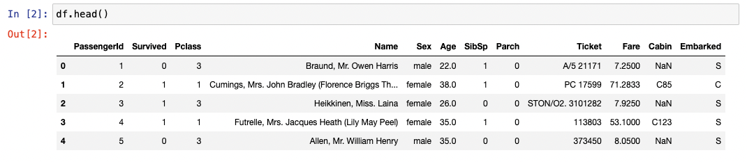
Good, looking a bit more spreadsheety. There is some data in a
familiar looking format, but how much? Here is the twin to head:
tail() We have chosen to get 10 rows by giving an argument to tail -
tail(10). We could have done the same with head().
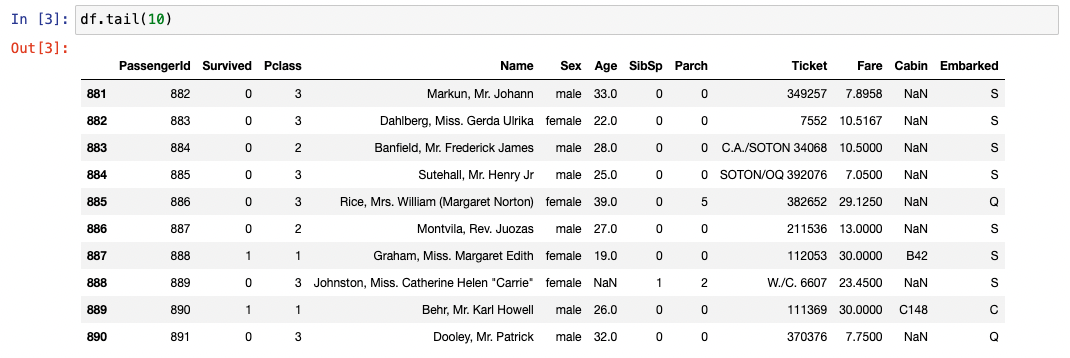
We have 891 rows - yes that’s correct 891. Indices in python start at 0 so we have rows 0 to 890 inclusive.
Onwards into the unknown
Unless we are working for GCHQ, we are likely to know a fair bit about the data. Lets take a look at the columns sequentially.
- PassengerId - Here it matches the index and is a unique identifier for the row
- Survived - Convention in computing is 0 = False and 1 = True
- Pclass - Looking like the passenger class
- Name - Clearly passenger name, but the format and contents look a bit variable
- Sex - Male and female only in 1912
- Age - Looking like it is in years, but note the
NaN- ‘Not a Number’. This is missing data - SibSp - Could be anything
- Parch - Could be anything else
- Ticket - Text and numbers looking like a serial number
- Fare - We might expect it to be strongly negatively correlated with Pclass.
- Cabin - A lot of missing data here - a hypothesis to test maybe?
- Embarked - Some ‘domain knowlege’ needed here - What were the points of embarcation. We elves only know of Southampton - perhaps this is the mysterious
S. Wikipedia would know.
Focussed exploration
Lets see how much data is absent. We can start with df.info()
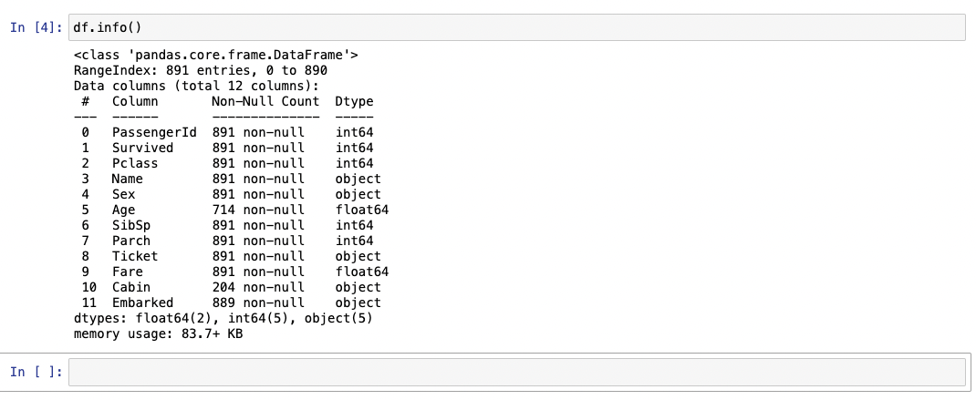
This gives us a summary of the data present and how it it stored. We
can see that there are 891 rows with the column names that we have
seen already by other means. We see how many pieces of data are
present - and by implication absent. Our impression that the cabin
data is very incomplete is confirmed. The data types are a bit more
technical but – for example – int 64 tells us that the data is
stored as an integer in 64 bits (8 bytes). You can’t put a name in
there as it stands (except for a certain kind of celebrity’s child).
We can get some summary data about the numerical data with df.describe()
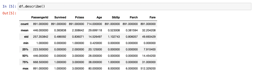
No use at all for the PassengerId, but telling us the age quartiles of the passengers and minimum, maximum and mean ages - for at least the 714 passengers for whom we have records. Ask yourself how you would do this for the ages of patients amongst a quarter of a million patients in an Excel spreadsheet. Pandas very handy, Excel not so…
How did women and children fare relative to men after the call ‘To
the lifeboats, women and children first!’? Time for a new method
value_counts() and a way of selecting subsets of rows and columns.
For the sake of brevity we’ll just examine women vs men.
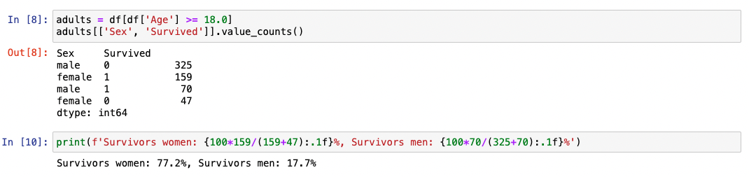
adults = df[df['Age'] >= 18.0] makes a new frame for passengers over
the age of 18. adults[['Sex', 'Survived']] just selects the two
columns relating to sex and survival from the whole adult data
frame, and then value_counts() gives the counts for all the possible
combination of values in the Sex and Survived columns.
Conclusion: The men were indeed chivalrous and went down with the
ship.
And now to medicine…
The kinds of things the historyElves have done here are equally applicable to medical data. A word, though, about information governance (IG). The best option is to have Anaconda installed on your organisational machine, but you will clearly need to have anonymised data and IG departmental approval for any data you might want to export from the system.
The calculations we have done here are deceptively simple. A little phrase in an elven tongue gives a result that actually requires a lot of computation under the hood to produce the outputs we have seen here. The utterance is no longer for a truly titanic sheet of a million rows of heath data than the modest ‘Titanic’ data frame we have been using here.
With no more than the simple tools displayed here we can find nuggets
of information for service transformation. We have found patterns in
radiological requesting that shows the most profligate requesters
demanding ten times the median referrer, and that such very high
volumes of requesting are associated with high GMC numbers (ie
inexperienced staff). These insights – which are pure gold (or
mithril if you are an elf) – come out of little more than
value_counts()…Now that thats digitalElf magic.
2026 Update: let AI guide your exploration
AI assistants have become a powerful companion for data exploration.
You can describe your dataset to Claude or ChatGPT – its columns,
data types, size, and what you are trying to understand – and get back
a suggested exploration plan: which columns to cross-tabulate, what
missing data patterns to investigate, and which visualisations to try.
You can even paste the output of df.describe() and ask “What stands
out here?”. The elven instinct for spotting patterns in data is now
augmented by a tireless AI colleague who never needs a tea break.