
Plotting a course on jupyter
We humans know very well the saying ‘a picture is worth a thousand words’. The elves have an equally important maxim - ‘A million numbers sure do need a picture’. Many digitalElves of yore inserted charts in spreadsheets to show ever-falling waiting times for battery replacment in elfHospitals, as technology assisted elfcare became ever more sophisticated.
You might like to try this down here for our sample data set Titanic data. You can see the raw data by clicking the link and choose to download it by control-clicking. I have downloaded this and made a pie chart in Google Sheets of the sexes of the passengers for illustration:

So far so good on Earth for modest data sets.
Plotting on jupyter
In the bad old days 10 years ago young elves struggled with programming - Ugh, all those brackets and symbols. By Ganimede, they are mighty grateful for the arrival of ChatGPT to help.
Why not boot up a jupyter notebook and do likewise. Lets replicate the pie chart, and export it as a .png file in the working directory, so that it is ready for insertion into another document. You can paste in the following into ChatGPT to get into the swing of it:
Give me python code to 1) load a file called 'titanic.csv' into a
data frame called 'df' 2) make a pie chart from the values in the
'Sex' column with a legend and a title 'Male and female passenger
proportions on the ill-fated RMS Titanic' 3) export the chart to a
file 'sex_pie_chart.png'
Here is the resulting response:

And here is the chart that is generated:

Looks convincing, but do we have confidence in the figures? It’s time for that old chestnut testing again. We previously mentioned ‘edge cases’ as important to testing, so lets include a couple of those, and run to generate a test dataset.
can you make a test data frame containing 5 passengers named
['Alice', 'Bob', 'Charles', 'David', 'Elizabeth'] in a column named
'Passenger Name' with sexes ['female', '', 'male', 'male',
'non-binary'] in a column named 'Sex', which is exported to a test
file 'titanic_test.csv'
We can then just change the reference in the original chart-generating
cell to titanic_test.csv rather than titanic.csv, and look
at the plot again. We would now be expecting three sex categories.
The most obvious way to deal with missing data is to ignore it, so we
should expect 25% female, 50% male and 25% non-binary in the final
chart.
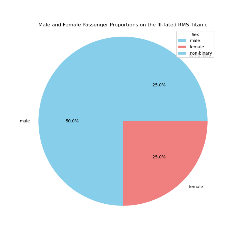
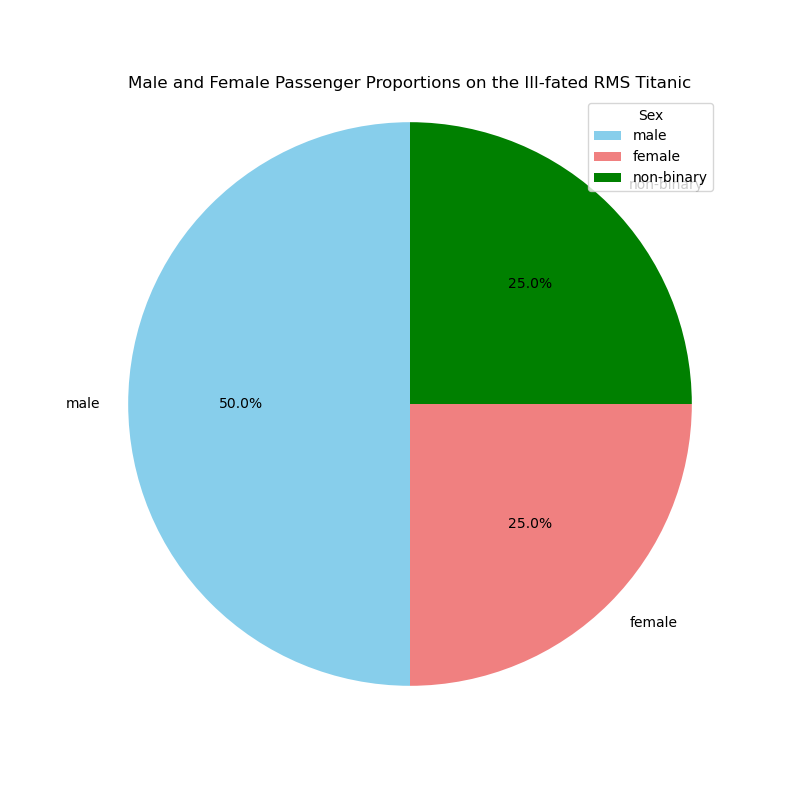
The only way the final chart has ‘failed’ is in the lack of separate
colours for male and non-binary - ChatGPT fell into the trap of
assuming only two sexes, but we can fix that by changing colors =
['skyblue', 'lightcoral'] to colors = ['skyblue', 'lightcoral',
'green'], for example, with the following result:
To the uninitiated, it may seem like hard work to bake a pie they
could have bought from Mr Kipling who – so the advert goes – bakes
Exceleedingly good pie charts. However, matplotlib is far more
comprehensive in its chart repertoire than Excel, the plots are far
more controllable in type and fomat, and we can deal with confidence
on much larger datasets.
The essence of what we have seen on Day 9 is that help from large language models is on its way to turn medics from progamming zeros at least halfway to heroes. It would be a shame to leave AI coding just to software developers to improve their productivity when it can also turn a non-programmer into someone who can quickly generate working code. The programming that has been done by the human here is to select the task, break it down into steps, express the steps carefully and precisely in English and sense-check the result before relying on it. We cannot pretend that this is foolproof, and that no specialist help will ever be needed, but the reliance on trained IT help can be very significantly reduced.
2026 Update: AI-generated visualisations have come a long way
This article was ahead of its time in demonstrating ChatGPT for code generation. Since then AI coding assistants have improved dramatically. They now handle more complex visualisations reliably, can generate interactive plots using libraries such as Plotly and Altair, and can iterate on designs conversationally: “Make the colours NHS blue, increase the font size, and add data labels”. Claude and GPT-4 are also much better at handling edge cases in data, such as the missing sex value in our test data. The core message of this article still holds: select the task, break it down, express it clearly, and sense-check the result.